Old notebooks
Recently I was cleaning out boxes of stuff from when I’d moved house and came across some of my old notebooks from about 11 years ago. Most of the notes were about project work and day-to-day admin stuff. Apparently, at some point I also started sketching out ideas for a different way of doing a desktop environment.
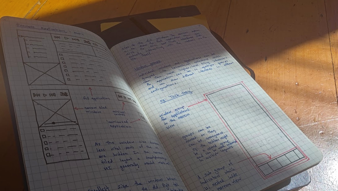
It’s interesting to see which of the ideas have found their way into other desktop environments and which ones don’t really make sense any more with the way we use computers in 2026.
Tiling/tabbed window manager
A main window is tiled alongside secondary windows, with space set aside for notifications and minimised windows.
Tabbed windows should be provided by the window manager. Individual tabs can change colour to get attention.
Universal keyboard shortcuts
All keyboard shortcuts that relate to the window manager or the base system should use the Windows/Meta key. This leaves Ctrl & Alt for individual applications. The Shift key can be used as a modifier to the Meta key commands. The Fn key is left for the function keys.
The keyboard shortcuts assume a standard QWERTY keyboard
with the exception that Esc and CapsLock are swapped.
11I’ve had this on every machine for years. I can’t imagine going back.
Shortcuts should be easily triggered from the standard touch-typing position.
Window hints
One key problem I’ve had with tiling window managers is knowing which window is currently active. This is particularly a problem when you have multiple screens. One option is to change the window colour of the active window (using GTK, etc.). The other option is to use a coloured border around the current window. The second option seems to be the most popular in current tiling window managers. There should also be some padding between the tiled windows.
Responsive layouts
Individual windows need to be able to respond to their changing dimensions and change their layouts to effectively use the space available. Smaller windows should show less detail than full screen applications and the content of the windows should rearrange itself to suit the window’s current shape.
Similar concepts already exist:
- Responsive CSS websites
- Android "Fragments"
- Windows 8 "Snap Views"
Ideally the transitions between the different layouts would be smoothly animated.
Example application: music
As the window size decreases, less vital parts of the UI are hidden. The app goes from the full application, to a narrow tiled window, to minimal controls, and finally to a 'minimised' application. 22The idea of a local app for managing music feels quaint these days. Streaming seems to have won pretty comprehensively. In the narrow tiled layout a smartphone-esque UI would generally work well.
At the smallest size the windows behave more like indicators in the old-style taskbars in GNOME and KDE. An outstanding question is how to manage the transition between the different sizes. There needs to be an easy way of going from the minimal tiles to the full window. The obvious option is to show the full application when you click the tile, but that interferes with actually interacting with the controls on the tile itself.
Window groups
Individual windows and applications can be grouped into hierarchical collections which can then have higher-level tiling behaviours. An application can be in multiple groups and can show different interfaces in different configurations.
e.g. "Task Tray"
Groups can be named, or they can be anonymous. For example, the taskbar might be a named group and could be referenced in multiple layouts.
This nested layout behaviour is quite similar to the way widget layouts work in GTK or Qt.
Application launcher
Launching applications is one of the most common actions a user performs. Following from the idea of doing as much as possible using the keyboard, it makes sense that the action of launching applications should largely be a keyboard-driven process.
Launching and switching between running applications are two sides of the same coin. It makes sense that the same interface should allow you to do both.
The application launcher is summoned using a keyboard shortcut. Either Meta+Enter or Meta+Space seem like good candidates. The application launcher should be displayed on a floating layer above the normal tiling windows.
The user can then start typing the name or a fuzzy description of the application and the launcher will display any open windows matching the string as well as any other applications to launch.
Choosing between switching apps and launching a new instance
If you combine the UI for switching apps with the UI for opening new apps you need a way to launch a new instance of an open app.
For example, you might have a terminal open already but want to open a new one.
The nicest solution I’ve come up with so far is to use Enter to select the already open instance (or launch a new instance if there isn’t one already open) and use Shift+Enter for the case where you want a new instance. That way the most common action (switching to the existing version) takes one key press but the next most common action still only takes two key presses.
Another idea for window switching
When using the app launcher to select from the currently open applications an overview/exposé type view is one way of visualising results.
As the incremental fuzzy search narrows down the list of apps to choose from the eliminated items can be faded out once the current search term no longer matches.
The user can cycle through the remaining options with the Tab key (or backwards with Shift+Tab) and select the window with Enter. If they want a new instance of that app they can spawn it with Shift+Enter.
Rearranging windows
In the tiling configuration individual windows don’t have titlebars for you to grab with the mouse to move the window around. Instead, you can press and hold the Meta key to go into a window management mode. In this mode you can drag windows around by clicking and dragging anywhere inside the window (like with Alt+drag in Metacity). 33This is basically how GNOME Shell works today. I completely forgot that older versions of GNOME used Alt for this. When you release the Meta key you go back to normal mode.
In the window-management mode you can drag the window to a screen edge to enable Aero Snap-style behaviour.
Prototyping applications
The vast majority of the current Linux applications don’t handle being resized particularly well. 44Apps didn’t really reflow very well if you went less than about 1/2 screen. This is something that has actually improved a lot over time. As a result I will need to do some experimenting with alternative UIs. The easiest way to mock up some responsive interfaces will probably be using HTML and CSS because there are already a number of frameworks for doing responsive design using these tools. The web UIs can be displayed in a simple WebKit window with no window decoration or chrome to see how the actual application would look.
Status tray
Some of the typical applications that could be minimised to a small tile-like notifier in the tray are mail, music, calendar, downloads and chat.
Persisting window groups to disk
This window system is targeted at workstation use by technical users. I expect that a typical user will have a core set of applications they use frequently for different tasks. Rather than making the user build up their window layout every time they start the work day the window manager should let them save a particular layout to disk and restore that layout and all the associated applications easily. 55I don’t think I was restarting my machine every day when I wrote this. Perhaps I was thinking more of saving standard layouts for different types of work. This way, getting a common layout sorted is a one-time action and the user can justify spending more time getting it perfect as the layout can be reused as needed.
Another benefit of being able to save layouts to disk is that the user can compose a number of separate applications into a composite application, for example:
Applications like Evolution can be separated out into their individual parts and recombined in the WM. Also, you could swap out parts like the calendar for an alternative if you wanted. 66The tech landscape in 2026 has gone the opposite direction. Everything that hasn’t ended up in a browser seems to have become an "everything app". This still makes me sad.
The real benefit of being able to construct composite applications like this would come if you could deep-link into other applications. For example, clicking a contact in an email could switch to the contacts app with the person’s contact page open. 77Mobile platforms have done okay with this, but there’s a trend towards trying to keep users inside closed ecosystems.
Use of colour in the UI
Colour can be a powerful tool for quickly communicating things to the user. If the GUI is consistent in the way it uses colour it can help the user to subconsciously process information without needing to take their focus off the task at hand.
A basic framework for using colours for notifications could be as follows:
- Blue = Purely informational (not good or bad)
- Green = Positive notification (e.g. download complete)
- Orange = Warning (e.g. battery is low)
- Red = Error/failure (App failed)
The main window chrome should minimise the use of colour so that any colour changes from notifications are easy for the user to see. 88This design idea is common in newer HMI standards like ISA-101. It seems that consumer-facing apps have gone the other direction, with a lot more colour in the UI as part of their branding.
Themes
The UI should provide two theme variants: A light coloured version based around light grey (~20% grey perhaps) and a dark version based on dark grey (~70% grey?).
The dark version of the theme would be used at night time so the screen isn’t too bright in a dimly lit room. 99I don’t think automatic "night mode" was very common when I wrote this. Multimedia apps, etc., can also use the dark variant to help emphasise the content.
Icons in the interface (i.e. non-content areas) should generally favour monochrome, symbolic style icons. However, colour should still be used where it helps the user to quickly identify functionality. For example: the button to delete an item should probably have some red in the icon. The icon for a folder-related action should be the same colour as an actual folder. This helps avoid the situation where you have huge toolbars full of barely distinguishable icons.
Window manager vs desktop environment
A window manager is a single-function piece of software which exists solely to manage windows on the desktop. It doesn’t provide functionality like auto-mounting USB drives or drawing a wallpaper on the desktop. These behaviours need to be provided by separate programs.
In the case of a desktop environment such as GNOME or KDE all of this functionality is provided by an integrated collection of utilities.
Icon themes
A coherent and well organised icon theme can help a lot with making the user interface intuitive and attractive. Colour must be used carefully so that it aids the user in navigating the UI quickly — harnessing the subconscious associations and sorting abilities.
There are some broad categories which all icons fit into. These are:
- Applications/programs
- Files
- Actions
- Status indicators
The level of detail and colour should roughly decrease as you go down the list.
Status indicator icons should be almost exclusively monochromatic unless they are indicating an unusual or particularly important state (e.g. very low battery).
Action icons are usually found in toolbars and dialog boxes. Actions should be generally identifiable by their shape; however, judicious use of colour can help the user to quickly locate relevant actions — as long as the visual language is consistent.
The colours used in toolbar icons should be less saturated than the colours used in notification or important status icons. This helps to create a visual hierarchy.
File and folder icons can generally be divided into 'documents' and 'special' files.
'Special' files are things like pictures or videos where the content can be quickly identified by sight: a thumbnail or frame from the content. 'Documents' are things like scripts, text files and word-processing files. For 'Document' filetypes the icon is generally created from a base icon and a filetype-specific part, for example:
Symbolic icons
The icon set must implement the freedesktop.org symbolic icon specification. These icons are monochromatic and have low detail. They are useful for things like status bars and indicators.
Dashboard / application launcher: other features
The application launcher shown in the Application launcher section drops down from the top of the screen like a blind, which is why I also call it the dashboard or blind. It should have other features depending on how it is invoked. For example, it makes sense to use that UI for displaying dialog boxes asking for elevated privileges.
Status bar / blind integration
The status bar should act as though it is part of the dashboard/blind part of the UI. When the blind rolls down (like the Quake terminal) the status bar should stay attached to the bottom.
The content of the blind should be extensible through plugins. Some examples of possible plugins are:
- Terminal (like Guake)
- Application launcher
- Shutdown/restart buttons
- Basic settings (wifi, volume, etc.)
- Semantic search
- Sudo dialogs
Content search
The system-wide search needs to be able to interact with the search functionality of individual applications. For example, if a system-wide search for a string returns a result inside a PDF, the PDF reading application should be able to use that search string to locate relevant content in the PDF when it is opened. This will help to remove a common step the user must manually perform.
Location-aware settings
The operating system should be aware of the location it is currently being used in and adapt itself accordingly. This may be through a combination of checking which networks are available, manual settings by the user, and other sources.
For example, if the computer knows it is on the user’s home network and plugged into mains power it could schedule downloads of available updates and begin a backup to a network location. If, however, the system finds itself using a tethered mobile connection it could prevent all network-intensive background operations to help avoid huge data bills.
These features would be useful for people such as students who frequently move between home networks and university networks where different behaviours are appropriate.
Movement and animation
The judicious use of movement in the UI can greatly enhance the usability and feel of an application.
By animating transitions between different states in the UI we can help the user keep track of what the application is doing. A good example is in Google’s Material Design style guide.
Any animations must be kept subtle and quick so they don’t interfere with the user’s flow. Also, the use of animation shouldn’t result in excessive CPU load. 1010This feels both quaint and also, sadly, still relevant for some systems. If the animation processing can be offloaded to the GPU then that would be ideal.